 Correct — on surface Do not — wordmark disappears
 Ascend Systems — Lighthouse 27 LLC
Everything you need to represent Ascend Systems correctly. Files, values and the rules that go with them. If something you need is missing, ask before improvising.
Colour values on this page are read from the live stylesheet at build time. They cannot drift from the site.
Shown on surface. See 01.
Correct — on surface Do not — wordmark disappears 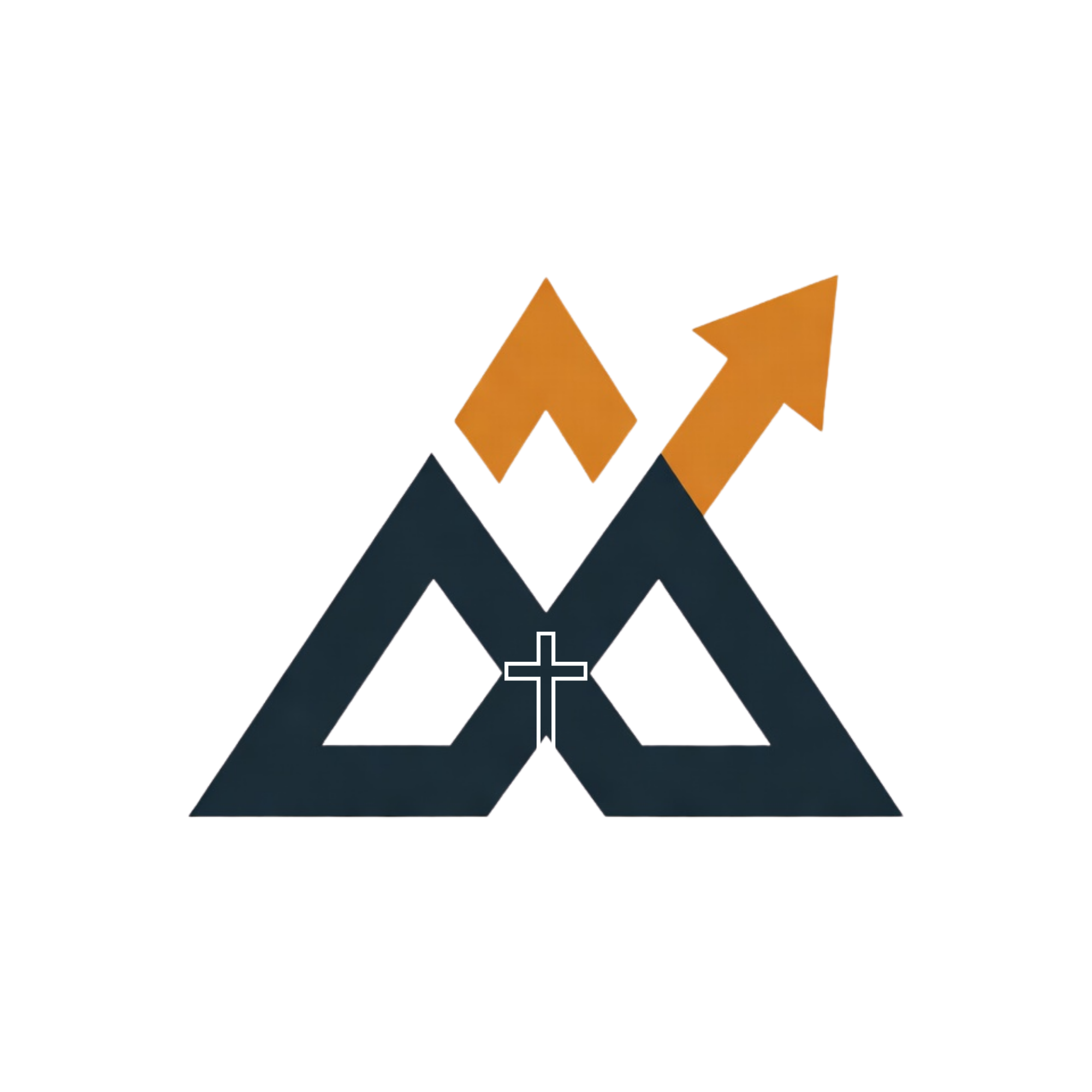 Do not — wordmark disappears Correct — on charcoal
 Pick the file that matches your background. The two lockups differ only in the wordmark: charcoal on one, white on the other. Put the charcoal wordmark on a dark surface and it vanishes. That is the failure shown above, and it is the most common way this logo gets used wrongly.
The filename “logo-mark-only” is misleading. It is not a mark-only file. It is the same full lockup with the wordmark reversed to white. There is currently no icon-only asset, so for favicons and avatars, crop the mark yourself or ask.
The peaks are charcoal in both files. On pure black they lose definition. Prefer the brand charcoal #1E2A32 or a mid-dark surface over true black.
Neither is vector. Both PNGs are 2000 × 2000, which holds up in decks, on the web and in moderate print. For large-format print, ask before scaling one up.
Clear space on all sides = the height of the “A” in ASCEND
Below roughly 120px the wordmark stops being readable and you should crop to the peaks alone. There is no packaged icon asset for this yet, so crop from the lockup that matches your background.
The two colours the brand is built from.
Surfaces and depth on dark layouts.
Accent only. It works because it is rare.
Light backgrounds and borders.
State only. Never decorative.
Headings & body
Inter
ABCDEFGHIJKLM
abcdefghijklm 0123456789
"Inter", system-ui, -apple-system, sans-serif
Data & technical values
JetBrains Mono
ABCDEFGHIJKLM
abcdefghijklm 0123456789
"JetBrains Mono", monospace
| Element | Size | Weight | Tracking |
|---|---|---|---|
| Display | 3.5rem | 800 | -0.03em |
| H1 | 2.75rem | 700 | -0.025em |
| H2 | 2.25rem | 700 | -0.02em |
| H3 | 1.75rem | 600 | -0.015em |
| Body | 1rem | 400 | 0 |
| Caption | 0.75rem | 500 | 0.02em |
Ascend Systems
Ascend
Always the full name. Never “Ascend” on its own, in body copy, headlines, or a URL slug you are writing by hand.
Words we use
Words we don’t